Role of Color Scheme in Presentation Design

Introduction:
Color scheme refers to a set of colors that are used together in a design or artwork. It is a planned combination of colors that are chosen to create a specific visual effect or to convey a particular mood or message. Importance of color schemes lies in their ability to evoke certain emotions or feelings, create harmony and balance, and enhance the overall visual appeal of a design. By carefully selecting and applying color schemes, designers can effectively communicate their intended message and engage the audience.
Basics of Color Theory
Color theory is the study of how colors interact with each other. It is an important concept in art and design.
Primary Colors:
- These are the basic colors that cannot be created by mixing other colors. The primary colors are red, blue, and yellow.
Secondary Colors:
- These colors are created by mixing two primary colors together. The secondary colors are green (mixing blue and yellow), orange (mixing red and yellow), and purple (mixing red and blue).
Tertiary Colors:
- These colors are created by mixing a primary color with a secondary color. For example, mixing red (primary) with orange (secondary) creates a tertiary color.
Types of Color Schemes
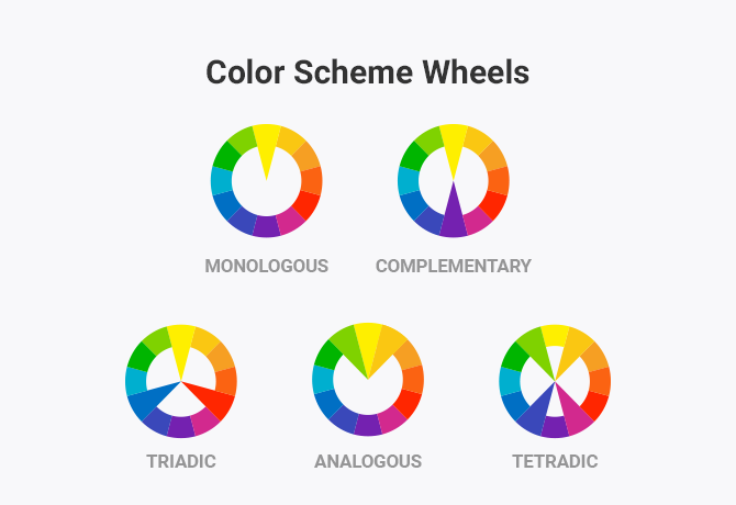
Monochromatic
This scheme involves using variations in the lightness and saturation of a single color.
Analogous
- This scheme refers to colors that are adjacent to each other on the color wheel.
Complementary
- This scheme involves using colors that are opposite each other on the color wheel.
Split-Complementary
- This scheme consists of a base color and two colors adjacent to its complementary color.
Triadic
- This scheme involves using three colors that are equally spaced around the color wheel.
Tetradic (Double-Complementary)
- This scheme consists of four colors together, in the form of two complementary color pairs.
Psychological Impact of Colors
The text discusses the psychological impact of colors, categorizing them into warm and cool colors.
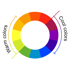
Warm Colors
- Red, orange, and yellow are considered warm colors.
- These colors are associated with emotions such as passion, energy, and warmth.
Cool Colors
- Blue, green, and purple are classified as cool colors.
- These colors have an impact on emotions and create a calming atmosphere.
The text uses terms like warm colors and cool colors to refer to specific groups of colors based on their psychological effects. These terms are commonly used in art, design, and psychology to describe the impact of different colors on emotions and mood.
Applications of color scheme
Color schemes are versatile tools applied across fields such as graphic design, branding, web design, interior design, and fashion. In graphic design, colors contribute to brand identity and evoke specific emotions in marketing. Web designers use them to enhance user interfaces, while interior designers create moods in spaces. Fashion designers align color schemes with seasonal trends. Colors play a role in marketing psychology, photography composition, and even therapeutic practices. In education, they impact learning environments, and in events, they establish themes. Accessibility considerations prioritize high contrast for readability. Urban and environmental planners use color schemes for cohesive cityscapes. Overall, a nuanced understanding of color theory enables professionals to make informed decisions for effective communication and desired outcomes.
Considerations in Choosing a Color Scheme
Choosing the right color scheme is crucial in design, impacting aesthetics and emotional resonance. Consider the project's purpose and target audience, using the color wheel for harmony or contrast. Prioritize readability through balanced contrast in text and background colors. Understand the psychological effects of colors to convey the desired emotions. Maintain consistency, incorporating brand colors for recognition. Test across contexts and devices for compatibility and seek feedback. Keep an eye on trends but strive for a timeless appeal. In essence, a thoughtful color scheme enhances visual identity and communication in any creative project.
Tools for Creating and Analyzing Color Schemes
Color scheme creation and analysis are crucial in design, and various tools simplify these tasks. Adobe Color Wheel, Coolors, Paletton, Color Hunt, and Material Design Color Tool assist in generating inspiring schemes. Adobe Color Wheel and ColorZilla facilitate scheme analysis and image color extraction. ColorHexa offers comprehensive color details, and the WebAIM Contrast Checker ensures accessibility standards. These tools collectively enhance the artistic and functional aspects of design.
Color schemes are vital in design, influencing visual impact and emotions. Understanding primary, secondary, and tertiary colors, along with warm and cool tones, empowers designers. Selection requires thoughtful analysis based on project goals, audience, and emotions. Consistency, readability, and brand recognition are crucial. Tools like Adobe Color Wheel streamline scheme creation. Balancing trends with timeless appeal ensures enduring visual identity. A nuanced understanding of color theory and strategic choices allow designers to captivate audiences creatively.